Display
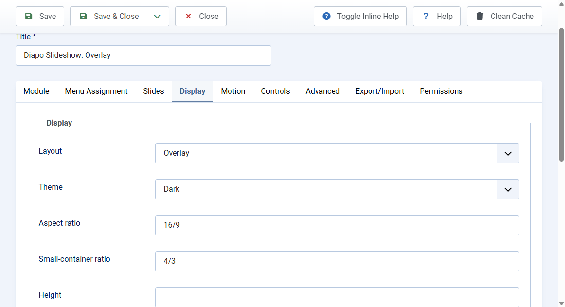
The Display tab controls layout, theme, and framing.
Layouts
- Overlay: caption sits on the image with a gradient. Default homepage hero
- Split: image stage plus a caption panel. Choose panel Right or Left. The two columns stack when the module is under 640px wide, including a narrow sidebar
- Stacked: image first, then the caption below
Theme
- Dark (default), Light, or Auto (follows the visitor colour scheme)
Size
- Aspect ratio: example
16/9. Leave empty for the engine default - Small-container ratio: used when the module is under 640px wide. Example
4/3 - Height: optional CSS length such as
70vhor480px. Overrides the ratio when set - Image fit: Cover (default) or Contain
- Image position: CSS object-position, for example
centerortop
Chrome (off by default)
- Corner radius: 0 is square. Set 8px or 12px only if you want a card
- Outer frame: None (flush with the page) or Thin (1px outline)
- Panel divider: None, or a thin line between image and caption in Split and Stacked
- Shadow: None or Soft
- Line colour: optional colour for frame and divider
Brand
- Accent colour
- Optional background, text, and panel background colours
Fonts inherit from the template. There is no font picker.