Styling Settings
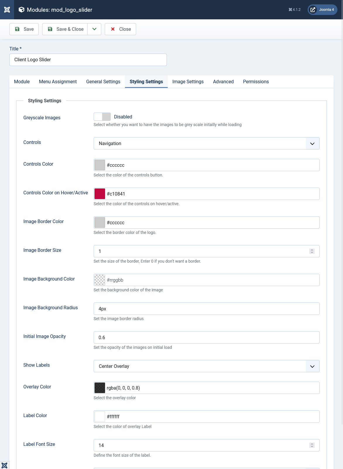
In styling settings you can customize the UI of the slider using the following parameters. If you want to add other changes besides the following parameters we will recommend to use the Extra CSS parameters in the Advanced Settings and add your own CSS.
- Greyscale Images : Set the greyscale to enabled if you want grey effects for the slide.
- Controls : Select the control which you would like to have for the slider. You can set to Pagination, Navigation, Both or None.
- Controls Color : Set the color of the navigation and pagination.
- Controls Color on Hover/Active : You can select the color of the navigation and pagination on hovering or clicking.
- Image Border Color : Set the color of the border around the slide.
- Image Border Size : You can set the border size in pixels. Ex : 2, which implies 2px.
- Image Background Color : Set the background color of the slide.
- Image Background Radius: You can set the radius of the background in pixels or percentage. Ex : 2px or 50%.
- Initial Image Opacity: Opacity of the images on page load. It ranges between 0 to 1, Ex : 0.5.
- Show Labels : The slider has option to show labels/caption for each image. The labels can be placed in different positions according to the requirements.
- Overlay Color : The label can be places as an overlay and the color of the overlay can be set using the color picker.
- Overlay Opacity : The opacity of the overlay ranges between 0-1, Ex: 0.8.
- Label Color : The color of the label can be picked using the color picker.
- Label Font Size : The label font can be set. Ex : 12px.
- Label Align: You can align the label and place it in different positions.