Testimonial Form Setup
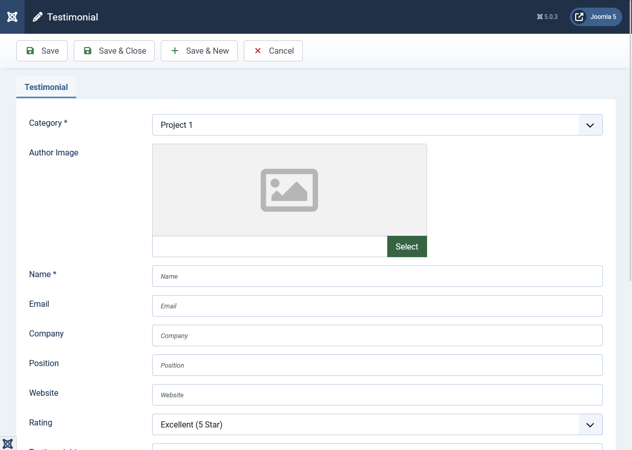
There are two main ways to add testimonials: manually entering them in the backend or allowing users to submit them via a form on the frontend. You can also use both methods together.
Method 1: Manually Adding Testimonials
This method is perfect for adding testimonials you've collected through other means or importing existing testimonials.
-
Navigate to Components > Responsive Testimonials Pro > Testimonials.
-
Click the New button in the top left corner to open the testimonial form.
-
Fill in the testimonial form fields:
- Category: Select one or more categories for this testimonial (required).
- Author Image: Click "Select" to upload or choose an author photo from the media manager. Optional but recommended.
- Name: Enter the author's full name (required).
- Email: Enter the author's email address (required).
- Company: Enter the company name (optional).
- Position: Enter the job title or position (optional).
- Website: Enter the company website URL (optional).
- Rating: Select a star rating from 1 to 5 stars (optional).
- Testimonial: Enter the testimonial text content (required).
- Status: Set to "Published" to display immediately, or "Unpublished" to save as draft.
-
Click Save or Save & Close to save the testimonial.
Method 2: User Submissions via Frontend Form
Users can submit testimonials through either a component form (attached to a menu item) or a module form (placed in any template position).
Option A: Setting Up the Component Form
The component form creates a dedicated page for testimonial submissions.
-
Create a Menu Item:
- Go to Menus > Your Menu (or any menu you want to use) and click New.
- In the Menu Item Type field, click "Select" and choose Responsive Testimonial Form > Testimonial Form.
- Enter a Menu Title (e.g., "Submit Testimonial" or "Share Your Experience").
- Set the menu item status to "Published".
-
Configure Form Settings:
- In the menu item configuration, go to the Form tab.
- Choose Category: Select one or more categories where user-submitted testimonials will be assigned. Hold Ctrl (Windows) or Cmd (Mac) to select multiple categories.
- Display Options: Configure which fields to show:
- Show/Hide Category field
- Show/Hide Company field
- Show/Hide Position field
- Show/Hide Website field
- Show/Hide Rating field
- Show/Hide Author Image field
-
Styling the Component Form:
- Go to the Styling tab in the menu item configuration.
- Customize form appearance including width, background colors, borders, padding, and more.
Option B: Setting Up the Module Form
The module form can be placed anywhere on your site - sidebar, footer, content area, etc.
-
Create the Module:
- Navigate to Content > Site Modules (or Extensions > Modules in Joomla 4/5/6).
- Click New.
- In the module type selection, choose Responsive Testimonials Pro - Form.
-
Module Basic Settings:
- Title: Enter a module title (e.g., "Submit Your Testimonial") or leave blank to hide the title.
- Show Title: Toggle to show or hide the module title.
- Position: Select where the module should appear (e.g., sidebar, footer, top).
- Status: Set to "Published" to display the module.
- Access: Choose who can see this module (Public, Registered, etc.).
- Menu Assignment: Choose "On all pages" or select specific pages where the form should appear.
-
General Settings Tab:
- Select Categories: Choose one or more categories for user submissions. If only one category is selected, it will be hidden from the form. If multiple categories are selected, users can choose which category to submit to.
- Show Category Field: Toggle to show or hide the category selection dropdown (only relevant if multiple categories are selected).
- Show Company Field: Toggle to show or hide the company name field.
- Show Position Field: Toggle to show or hide the job position field.
- Show Website Field: Toggle to show or hide the website URL field.
- Show Rating Field: Toggle to show or hide the star rating field.
- Show Author Image Field: Toggle to show or hide the author photo upload field.
-
Form Container Styling Tab:
- Heading Alignment: Choose left, center, or right alignment for the form heading.
- Enable Subheading: Toggle to show or hide a subheading below the main heading.
- Subheading Text: Enter custom subheading text (HTML allowed).
- Subheading Color: Set the color for the subheading text.
- Layout Columns: Choose single column or two-column layout for form fields.
- Form Width: Set form width (e.g., "100%" for full width, "800px" for fixed width).
- Theme Color: Set the primary theme color used for buttons and focus states.
- Enable Background Color: Toggle to enable or disable form background color.
- Form Background Color: Set the background color (supports RGBA for transparency).
- Form Padding: Set internal padding (e.g., "2rem", "20px").
- Form Border Radius: Set rounded corners (e.g., "12px", "8px").
- Form Border Color: Set border color.
- Form Border Thickness: Set border width (e.g., "1px", "2px").
- Enable Form Shadow: Toggle to enable shadow effects.
- Shadow Settings: If shadow is enabled, configure:
- Shadow X Offset (horizontal position)
- Shadow Y Offset (vertical position)
- Shadow Blur Radius (softness)
- Shadow Spread (size expansion)
- Shadow Color
- Enable Shadow on Hover: Toggle to show enhanced shadow when hovering over the form.
- Hover Shadow Settings: Configure hover shadow properties (same options as above).
-
Label Styling Tab:
- Label Color: Set the text color for form labels.
- Label Font Size: Set label font size (e.g., "14px", "16px").
- Label Font Weight: Choose from normal, bold, or numeric values (100-900).
- Label Bottom Margin: Set spacing between label and input field (e.g., "8px").
-
Input Field Styling Tab:
- Input Padding: Set internal padding for input fields (e.g., "12px 16px").
- Input Border Radius: Set rounded corners for inputs (e.g., "8px").
- Input Border Color: Set border color for input fields.
- Input Focus Border Color: Set border color when field is focused (leave empty to use theme color).
- Input Background Color: Set background color for input fields.
- Input Text Color: Set text color inside input fields.
- Input Font Size: Set font size (recommended: 16px or larger to prevent mobile zoom).
- Field Spacing: Set vertical spacing between form fields (e.g., "24px").
- Textarea Height: Set height for testimonial textarea (e.g., "150px").
-
File Upload Styling Tab:
- Upload Area Border Color: Set border color for file upload area.
- Upload Area Background Color: Set background color for upload area.
- Upload Area Hover Background: Set background color when hovering over upload area.
-
Button Styling Tab:
- Enable Button Icon: Toggle to show or hide icon in submit button.
- Button Icon Class: Enter FontAwesome icon class (e.g., "fa fa-paper-plane", "fa fa-check", "fa fa-send").
- Button Hover Color: Set background color when hovering over button.
- Button Width: Set button width (e.g., "100%", "200px", "auto").
- Button Text Color: Set text color of submit button.
- Button Text Color on Hover: Set text color when hovering over button.
- Enable Button Hover Shadow: Toggle to show shadow effect on button hover.
- Button Font Size: Set font size for button text.
- Button Font Weight: Choose from normal, bold, or numeric values (100-900).
- Button Border Radius: Set rounded corners for button (e.g., "8px").
-
Advanced Options Tab:
- Module Class Suffix: Add a custom CSS class suffix for additional styling (optional).
- Custom CSS: Add your own CSS code for complete design control. This CSS will be applied directly to the module.
-
Click Save or Save & Close to save your module configuration.