Appearance
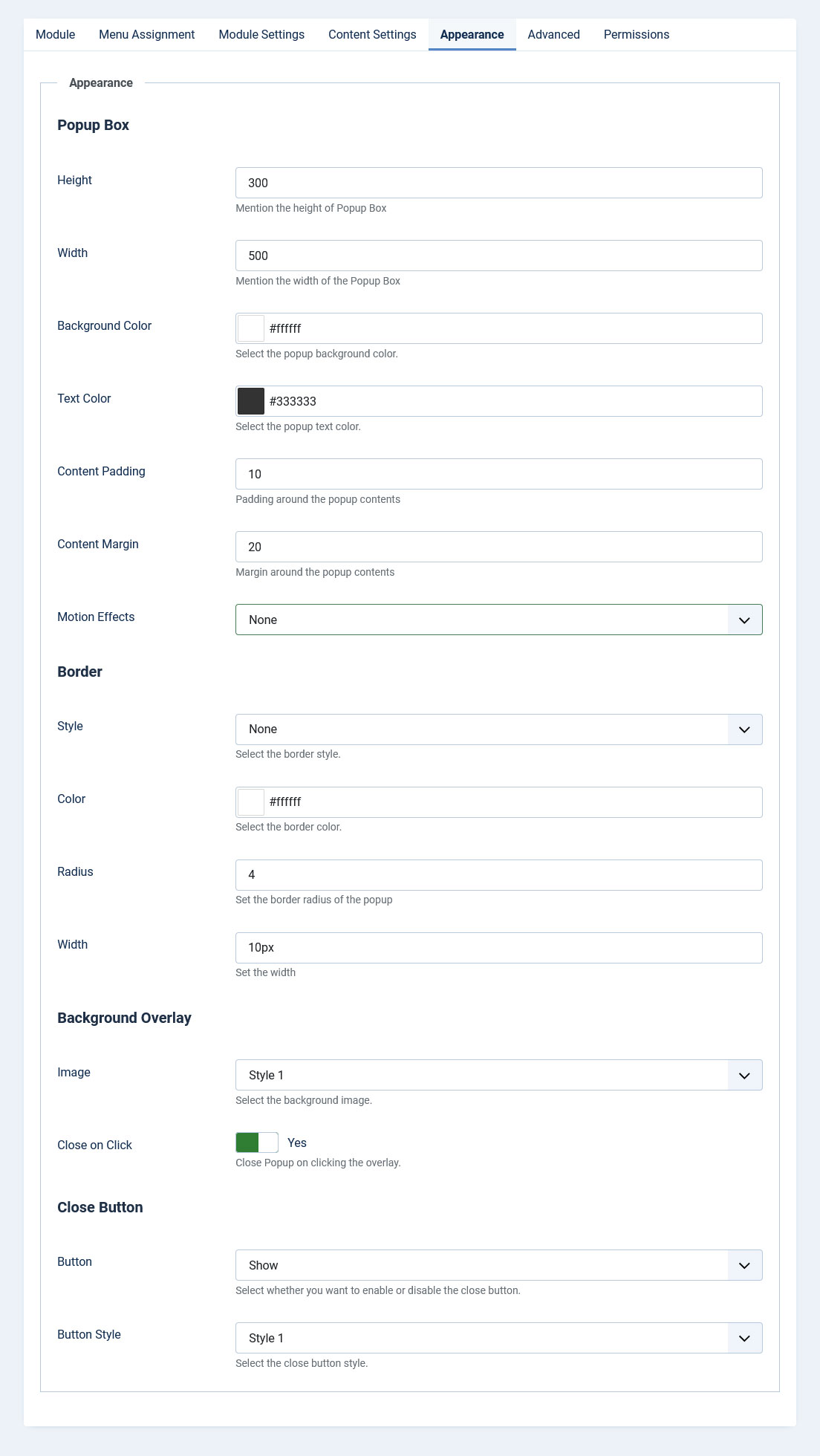
Popup Box Design
- Popup Position: Choose where your popup appears on screen (center, top-center, bottom-center, top-left, top-right, bottom-left, bottom-right).
- Width: Set the popup width in pixels or percentage (e.g., 80% or 500px).
- Height: Set the popup height in pixels or percentage (e.g., 70% or 400px).
- Minimum Width: Set the minimum width in pixels to ensure the popup doesn't become too narrow.
- Minimum Height: Set the minimum height in pixels to ensure the popup doesn't become too small.
- Maximum Width: Set the maximum width in pixels or percentage to constrain the popup size.
- Maximum Height: Set the maximum height in pixels or percentage to constrain the popup size.
- Responsive Sizing: Enable or disable responsive sizing. When enabled, the popup will automatically adjust based on screen size breakpoints.
- Mobile Breakpoint: Set the screen width (in pixels) considered as mobile devices (default: 768px). Only applies when Responsive Sizing is enabled.
- Tablet Breakpoint: Set the screen width (in pixels) considered as tablet devices (default: 1024px). Only applies when Responsive Sizing is enabled.
- Background Color: Choose the background color of your popup using the color picker.
- Text Color: Select the color for text displayed inside your popup.
- Content Padding: Set the space between your content and the popup border. Can be a single value (e.g., 10px) or multiple values for different sides (e.g., 10px 20px 5px 15px for top, right, bottom, left).
- Content Margin: Set the space around the popup content box. Can be a single value (e.g., 20px) or multiple values for different sides.
- Motion Effects: Select an animation for how your popup appears and disappears. Choose from Fading, Zooming, Bouncing, Sliding, Attention Seekers, Light Speed, or Special effects.
- Animation Duration: Control how fast or slow the animation plays (normal, slow, slower, fast, faster). Only applies when an animation is selected.
Border Settings
- Style: Choose a border style (solid, dashed, dotted, etc.).
- Color: Select the border color and opacity.
- Radius: Set rounded corners by specifying a border radius (e.g., 4 for slightly rounded, 20 for very rounded).
- Width: Specify how thick the border should be.
Background Overlay
The overlay is the semi-transparent layer that appears behind your popup.
- Enable Overlay: Turn the overlay on or off completely.
- Image: Choose from 10 predefined patterns, or select "none" to use a solid color instead.
- Color: Set the background color and opacity of the overlay. For a transparent overlay, set opacity to 0.
- Close on Click: Enable this to let users close the popup by clicking anywhere on the overlay. Disable it to force users to use the close button.
Close Button
- Button: Show or hide the close button.
- Button Style: Choose from 10 predefined styles, or select "custom" to use your own styling.
- Button Position: Select where the close button should appear (top-right, top-left, etc.).
- Color: Set the color of your custom close button.
- Size: Specify how large the custom close button should be.