Appearance
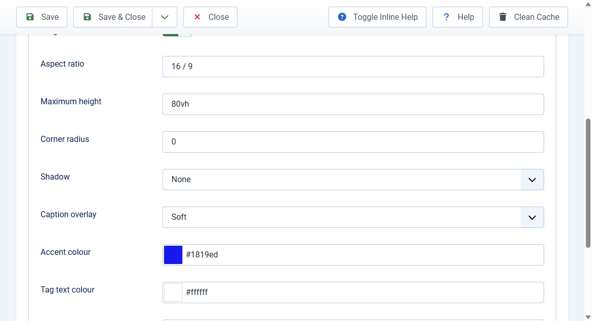
The Appearance tab sets the buttons, size, and styling.
Controls
- Arrows, Dots, Counter, Progress bar: each can be shown or hidden
- Dots hide automatically when there are more than 12 slides
Size
- Aspect ratio: width / height, for example
16 / 9(default),21 / 9,4 / 3, or1 / 1 - Maximum height: any CSS length such as
600pxor70vh, ornone. Default80vh
Styling (flat by default)
- Corner radius: 0 keeps square corners. Use
12pxor18pxfor a card look - Shadow: None (default) or Soft
- Caption overlay: Soft (default), Strong, or None. The gradient keeps caption text readable
- Accent colour: active dot, tag pill, progress bar, and focus ring
- Tag text colour and Background colour (shown while images load)
- Font: Template font (default) or System font
- Title element: H2, H3 (default), or H4 to fit your page headings
Leave colour fields empty to use the built-in defaults.