Layout and visual
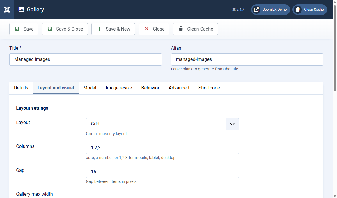
Open the Layout and visual tab. These settings control how the grid looks on the site.
Layout settings
- Layout: Grid (even rows) or Masonry (brick layout for mixed heights)
- Columns:
auto, a number such as3, or1,2,3for mobile, tablet, desktop - Gap: space between photos in pixels (example: 16)
- Gallery max width: example
1200px. Leave empty for full width of the page column - Item aspect ratio: example
16/9,4/3, or1/1. Leave empty for natural size. Ignored in masonry
Visual settings
- Corner style: Rounded or Flat
- Show card shadow: Yes adds depth under each photo
- Accent colour: filters, active states, and highlights (default #0005f0)
- Show gallery filter: Yes shows category buttons when categories exist
- Show gallery caption: Always, On hover, or Hide
Image filters (optional)
- Image filter: None, Grayscale, Sepia, Blur, Brightness, Contrast, Saturate
- Filter amount: 0 to 100 for grayscale and sepia, 0 to 200 for the others
- Filter on hover: Remove filter on hover, Add filter on hover, or No hover effect
Student tip
Start with Layout = Grid, Columns = 1,2,3, Gap = 16, Caption = On hover. Change one setting, Save, then refresh the front end.